Now-old version of tele2.ru during evaluation
Now-old version of tele2.ru during evaluation
Lab Wonderfull, Moscow
January - December 2016
- leading user research and research analysis
- project management in the design phase
- UI design (wireframes)
- leading HTML/CSS activities
- assembling a UI design system and style guides
Tele2 Russia, a major telecom operator, has approached design consultancy Lab Wonderfullback in late 2015 and invited us to do a design project for them. The main goals for the project were to define a design strategy for the company's digital products and implement the strategy in a redesign of Tele2's website. The strategy was meant to become the foundation for all future digital products made by Tele2 and had to maintain focus on designing for users' needs, helping Tele2 in embracing the human-centered design approach.
This pursuit for the new digital design strategy was necessary due to the recent expansion of Tele2's business to Moscow and neighboring regions. These markets were long-occupied by Tele2's major competitors, and Tele2 was initially perceived by possible clients as an outsider with no reason to be trusted. Tele2 decided to conquer the audience with its promise of simplicity, honesty, and visible human-centered approach.
At the time of the mentioned business expansion, Tele2 did not have enough competence in human-centered design among their internal design team. This meant that besides coming with a human-centered digital design strategy, the company also needed to raise this competence internally to be used in future design projects.
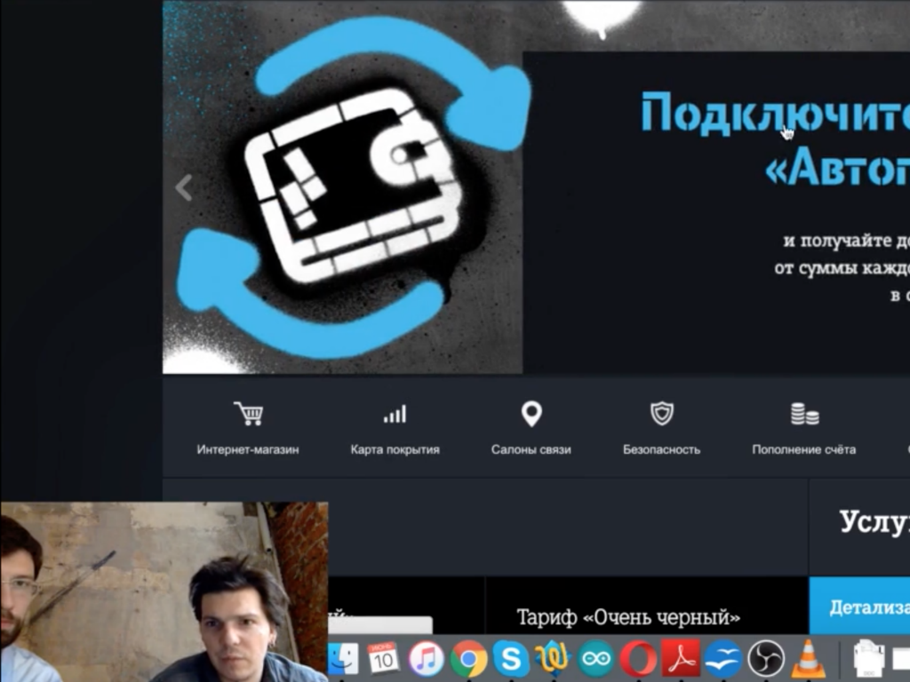
The now-old Tele2 website was evaluated at the beginning of the project. Tele2 agreed with our opinion that the website neither appealed visually nor presented the visitor with easy ways to solve his or her task. The problem was that when designing that website Tele2 did not have a clear understanding of why clients visit the website and what they should be served with during the visit.
Now-old version of tele2.ru during evaluation
Now-old version of tele2.ru during evaluation
The whole internal Tele2 design team along with many their colleagues from other departments represented the users of our design strategy solution. We had to make sure we provide them with appropriate instruments and principles of human-centered design, adapted when necessary to the specifics of the telecom industry.
As far as the website's audience, at the beginning of the research phase our team made an approach at defining its personas. We quickly understood that the scenarios which lead people to mobile operators' websites do not depend on age, profession, or any other characteristic of a person. Thus, every user of mobile services became a potential client of our digital solution.
At the beginning of the project, the team consisted of seven people: three design researchers (myself included), one graphical designer, information architecture specialist, business analyst, and project manager. Once the user research ended and we entered the design phase the team grew with two UI designers and several researchers to support a large amount of prototype testing. Some researchers, myself being one of them, also worked on prototypes along with UI designers.
I joined the project in its early stages as a user researcher and later accepted responsibility for leading the research analysis phase. I have done dozens of in-depth interviews, secondary research activities, presented findings to my teammates using various communication tools.
Once the research was done, I co-authored the design strategy document with two of my colleagues. Entering the design phase, I switched to the project manager role and ran communications with the client. I was responsible for scheduling design sprints and being in close contact with all team members to ensure we deliver each milestone of our design phase on time. Simultaneously, I led the prototype testing activities, ensuring quick turnaround of feedback from our users.
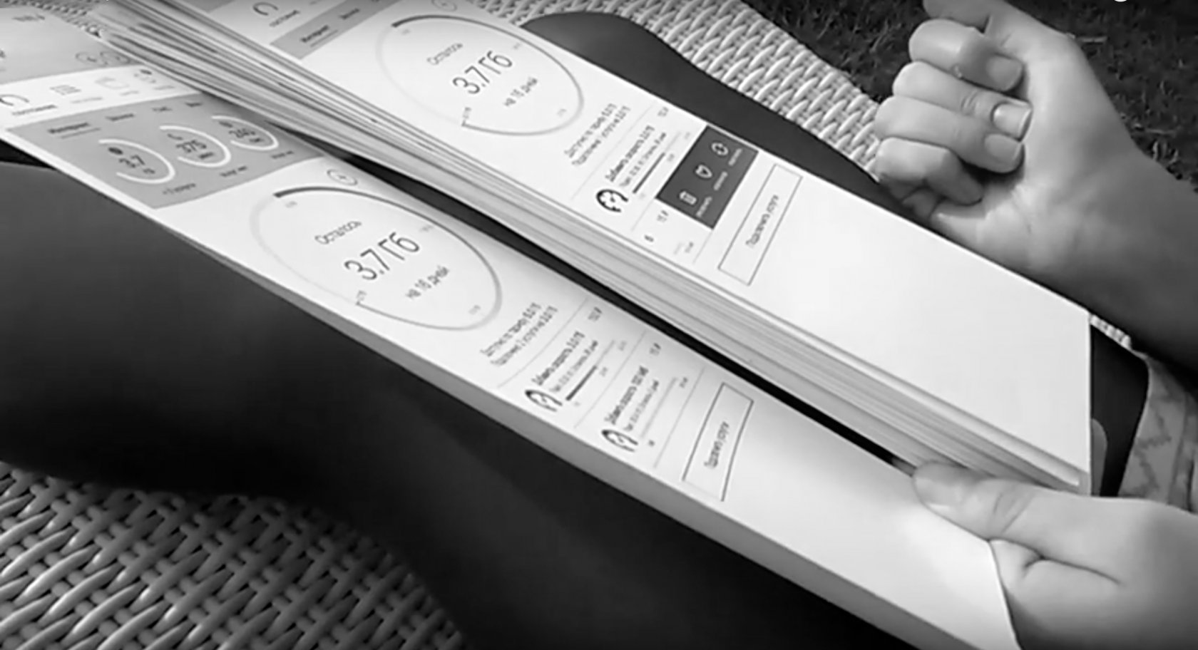
Testing paper prototypes with random people (guerilla research) in Gorky Park
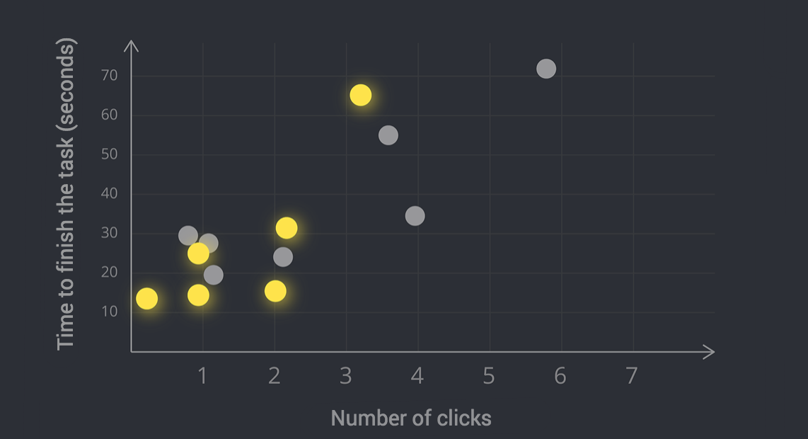
Comparions of time and effort it took users to complete a task (bright spots - our new tele2.ru, dim ones - competitor websites)
At the last stages of the project I, together with another colleague, co-developed Tele2 website from our high-fidelity prototypes into HTML and CSS. I was responsible for building and maintaining the design system, and later making it into a separate deliverable for Tele2. We later learned that this design system, along with our design principles and design strategy, help Tele2 in explaining internally the value of human-centered design and how it can be achieved.
We used the traditional design thinking approach in that we started with user research and to later inform the design with our findings. The research phase lasted three months during which we did over 100 in-depth interviews, secondary research, trend analysis, ethnographic inquiries, and tested dozens of hypotheses about the use of digital touchpoints in telecom services.
After we gathered our findings we entered an extensive research analysis phase, which culminated with our first deliverable - a design strategy document that listed key design principles. These principles allow for the development of digital products with end-user in mind and support major trends in the design of digital products and services.
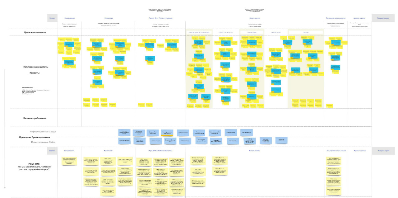
Mind map with key research findings grouped by themes an by user journey's phases (top half). Design principles and Point of View / How Might We statements (bottom half).
After the research, we entered an 8-month long design phase. We worked in 3-week sprints - for each sprint we would design, prototype, and test solutions for a particular set of user scenarios. This allowed us to gradually build a design system composed of standardized design blocks and UI elements with clear descriptions of how they should be used when designing Tele2’s website. Using the design system approach gave us huge time advantage in the last couple of months of the project as we were able to quickly execute on our design ideas and test them with users almost instantly.
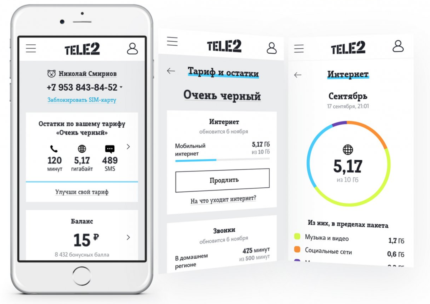
One of the design principles in action, namely the "gradual increase of information depth", put to use when explaining user's data usage statistic.
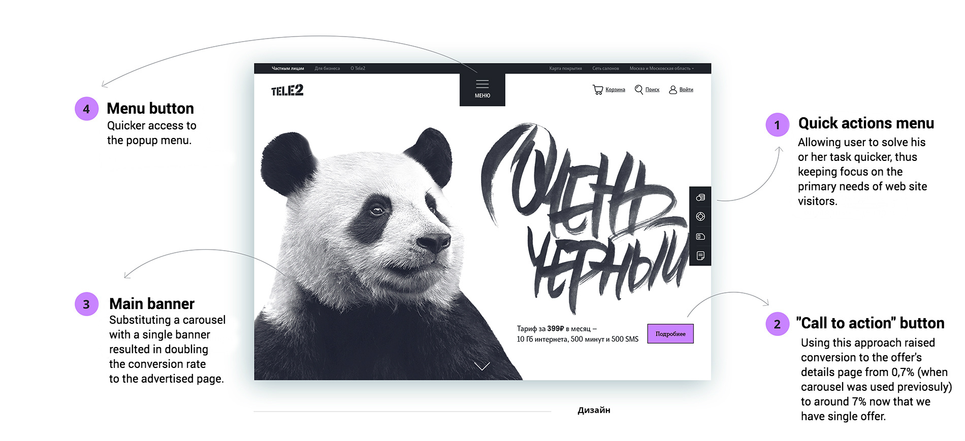
The new approach to the menu.
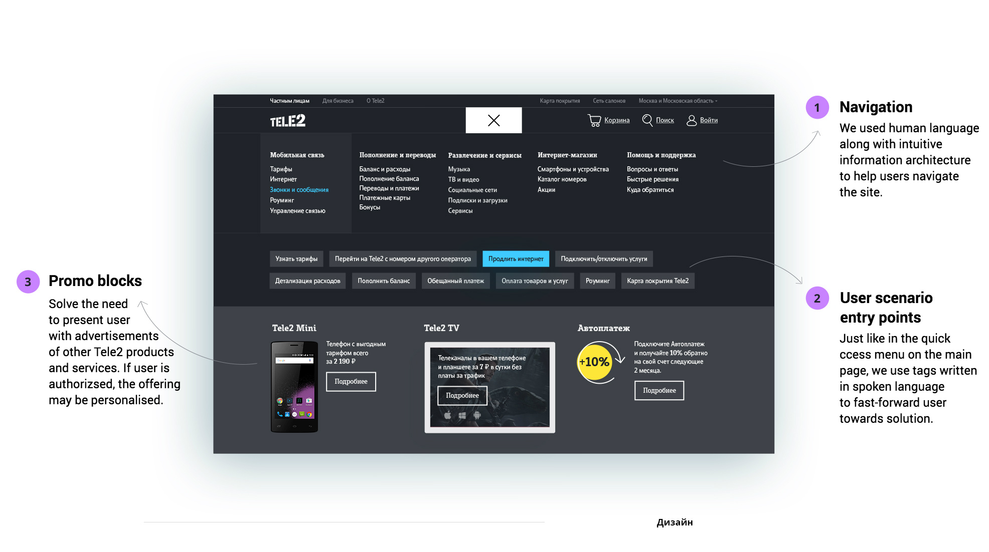
Showing that new designs solves not only user needs, but helps reach business goals as well.